Visualization
Here we outline ways in which you can visualize the data output by #k@.
Gephi
You may visualize the output data using Gephi, the visualization tool primarily used in this documentation. Gephi works best on graphs with a smaller (~1000) number of agents.
The network we visualize here is the one created in Tutorial 5.
How to Visualize a Network
Download Gephi then enter the program. NOTE: This documentation refers to Gephi 0.8.
Gephi 0.9 has a different interface. Gephi 0.9 will open 0.8 files but not vice versa.
These are the steps necessary to visualize the networks you've created:
-
When entering the program, you will see a prompt similar to the one below appear on the screen.
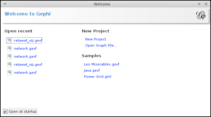
Under 'New Project' click 'Open Graph File' to access the appropriate output file created from your network simulation to be used in Gephi.
-
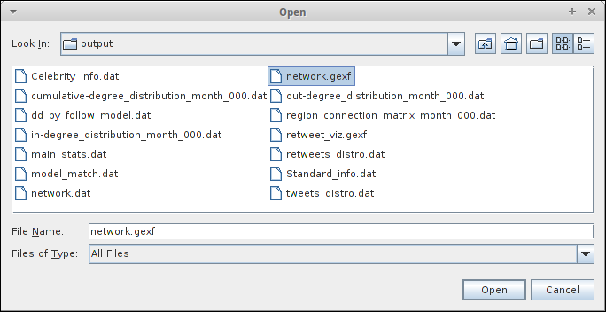
The information to visualize your network is the network.gexf file. The most popular tweet on your network is in the retweet_viz.gexf. These can be found in the output directory after running a simulation. Click on the file you prefer and press 'Open'.
-
After opening the graph file (.gexf), the following prompt will appear.
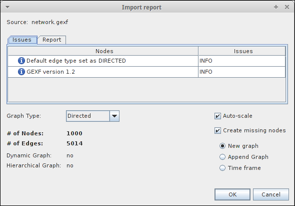
There is nothing that you have to change here so you may simply press 'OK' and the outline of your created network will appear.
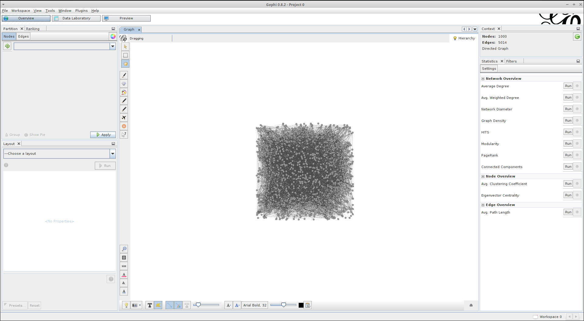
It is important to note that in the top right hand corner of the screen you will see the following, though with most likely different numbers:
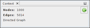
This details the number of nodes (agents) in the network and the total number of edges (connections/followings) within it.
-
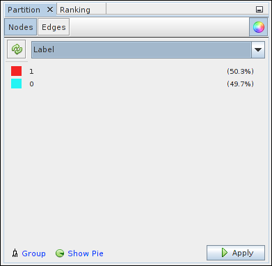
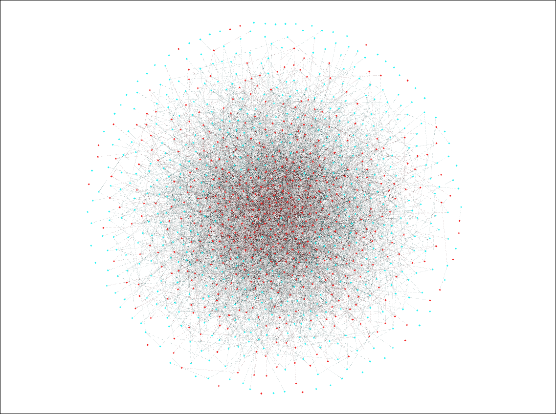
To differentiate between the node types in your system, in Gephi 0.8, click the refresh button in the 'Partition' box on the left hand side of the screen and under '---Choose a partition parameter' click 'Label'. This will show each node type numbered by how they were ordered in the input file, their percentage out of the total number of agents, and their corresponding colour in the visualization. An image of this box is shown below
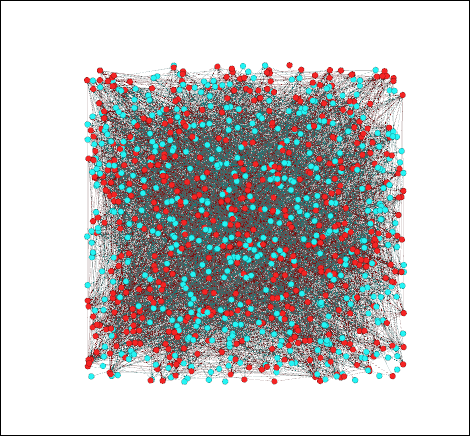
Click 'Apply' to implement this labelling in to your visualization, giving you a visualization similar to the one below:
Gephi 0.9 partition may be found under Appearance tab.
-
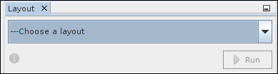
To modify the layout of your network, go to the 'Layout' window on the left hand side of your page (shown below), choose the layout you would like to use, and press 'Run':
Explore
Now that you have set up your visualization of your network simulation, you are encouraged to explore all the features of Gephi that you can use for your visualizations. Two network layouts that we primarily use in this documentation are the 'Fruchterman Reingold' layout:
and the 'Yifan Hu' layout:
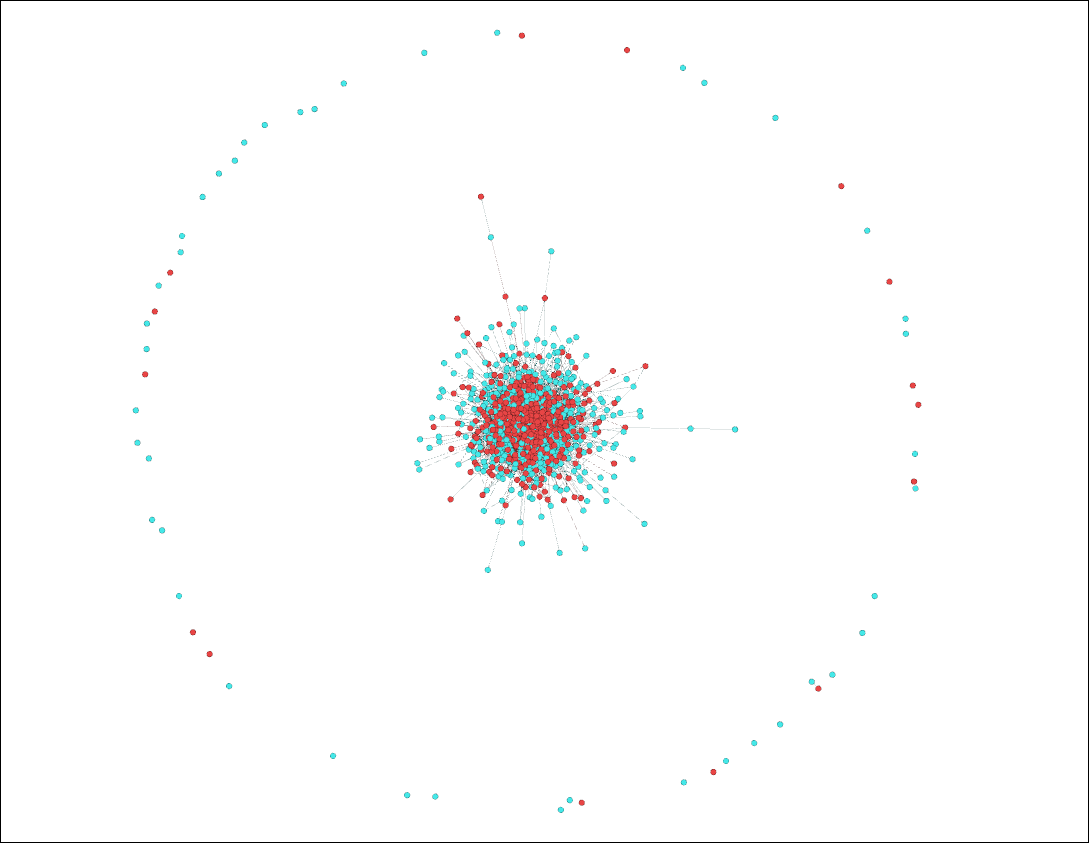
(Note: we used the 'Contraction' layout in conjuntion with the 'Yifan Hu' layout for the above to fit everything onto the screen)
There are numerous other modifications and adjustments that can be made to your visualization. Ones which we use fairly often can be found at the bottom of your screen.

By left clicking the light bulb button, you can change the background from white to black or vice-versa, and by right clicking it you can change the background color to whatever colour you'd like. By moving the edge weight scale, you can also adjust how emboldened the connection lines are in your visualization.
This just scratches the surface of all that you can do using Gephi. Try experimenting with some of its other features and see which configuration of your network visualization you like the best.
Networkx
You can also visualize the networks you've created using Networkx.
Networkx is a Python language software package that can be used to create, modify, and analyze networks. To install Networkx on to your computer, enter into the command line:
pip install networkx
visualize.py
We have pre-prepared a script /~hashkat/visualize.py to visualize and analyse your network in Networkx. Simply enter the following command after running a simulation:
./visualize.py
This will produce a plot of your network using Networkx, and will save the plot to graph.svg. This script will also run the analysis functions and algorithms discussed below.
Plotting Your Network
To manually create a Networkx graph of your network after running a simulation, enter Python by typing in the command:
python
In Python, type in the following to create a graph of your network:
import matplotlib.pyplot as plt
import networkx as nx
G = nx.read_edgelist('output/network.dat')
pos = nx.spring_layout(G,iterations=75)
nx.draw(G,pos)
plt.show()
This will produce a plot similar to the one below:
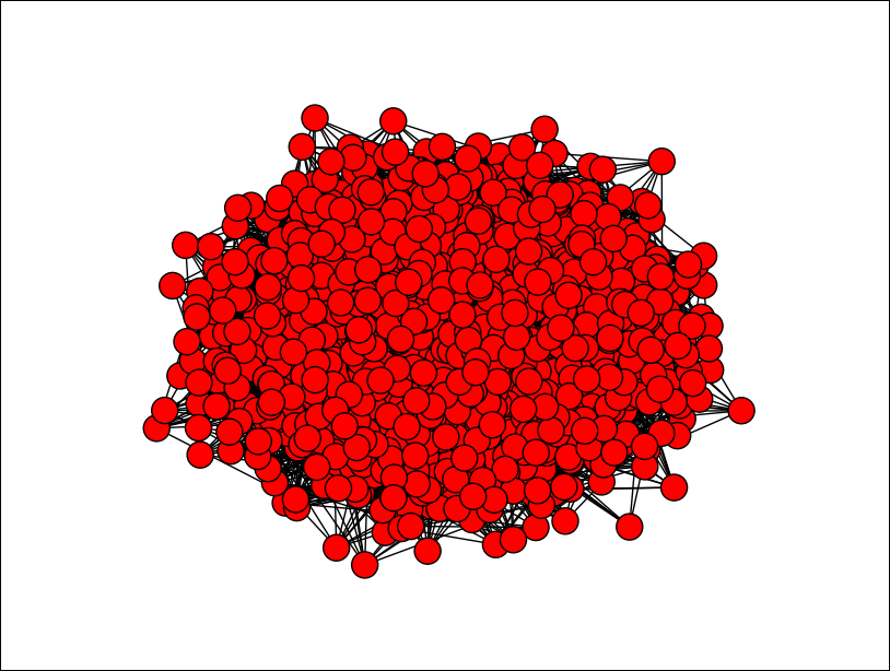
Similar to our visualizations using Gephi, the red nodes in the above graph correspond to agents and the black edges in between them correspond to connections/followings between agents. It is important to note however that there is no way to distinguish between the different agent types via this method.
Number of Nodes
To ascertain the number of nodes present in your network, type the command:
nx.number_of_nodes(G)
Number of Edges
To find the number of edges in your network, entering the command:
nx.number_of_edges(G)
Most Popular Agent
To find the most connected agent and its corresponding 'cumulative-degree', enter the commands:
from operator import itemgetter
sorted(G.degree_iter(),key=itemgetter(1),reverse=(True)[0:1])
This will print to the screen (though most likely with different values):
[(u'938', 35)]
In this case, '938' corresponds to the ID of the most connected agent and '35' corresponds to the cumulative-degree of this agent.
Most Common Cumulative-Degree
You can find the most common cumulative-degree of agents in the network and the number of agents with that cumulative-degree by entering the commands:
from operator import itemgetter
max(enumerate(nx.degree_histogram(G)), key=itemgetter(1)))
This will print to the screen (though most likely with different values):
(20, 90)
where '20' corresponds to the most common cumulative-degree and '90' corresponds to the number of agents with that cumulative-degree.
Graph Density
A dense graph is one in which the number of edges in a network are very close to their maximum value. A network's graph density can have a maximum value of 1 and a minimum value of 0. You can calculate the graph density of your network by typing in the command:
nx.density(G)
Average Shortest Path Length
The average shortest path length is the shortest number of edges on average between any two nodes in the network. You can calculate this value for your network by inputting the command:
nx.average_shortest_path_length(G))
Explore
Though we discuss Gephi in much greater detail in this documentation, you are encouraged to analyze your networks using Networkx. Other data output files are under development. If you have a preference please let us know.
You are encouraged to explore all of Networkx's features and functionalities to understand all the ways in which you can analyze the data you've collected from running #k@.
WebGL Globe
WebGL Globe is an open platform for geographic data visualization.
Here we have visualized user locations and the aggregate tweets on the globe created using the WebGL.
Soure code : hashkat/hashkat.github.io/tree/master/hashkat_visualizations
To create a visualization like this, use the above code and make changes as:
- Create a new JSON File similar to test.json following the format
var data = [
    [
    'seriesA', [ value1, value2, value3, value1, value2, value3, value1, value2, value3,  ... ]
    ],
    [
    'seriesB', [ value1, value2, value3, value1, value2, value3, value1, value2, value3, ... ]
    ]
];
where value1 is the latitude, value2 is the longitude and value3 is the magniude.
- Point to the new JSON file in main.js#L44 and make changes accordingly to files like index.html and main.js depending on the number of options utilized.
... more details coming soon